
AI Powered EMR
Overview
Transforming clinical documentation through intelligent voice control and intuitive design. Reduced doctor appointment documentation time by 75% (from 15-20 minutes to 3-5 minutes) while achieving 95% AI transcription accuracy through a user-centered design approach that prioritized simplicity and clinical workflow efficiency.
Categories
Healthcare
EMR
Date
Apr 2025
Client
Manorama Infosolutions
Project Overview
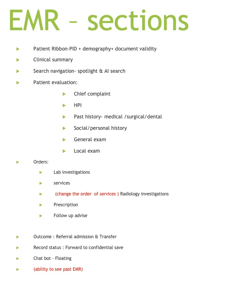
Manorama EMR is a next-generation electronic medical records system that uses AI-powered voice control to streamline clinical documentation. The project addressed a critical inefficiency in healthcare: doctors spending excessive time on administrative tasks rather than patient care.
Understanding the Problem
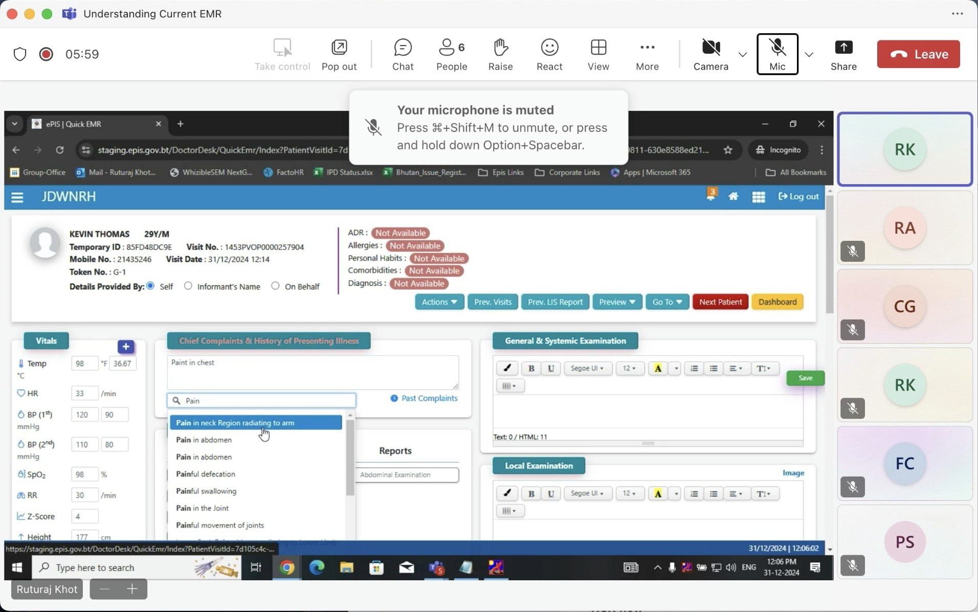
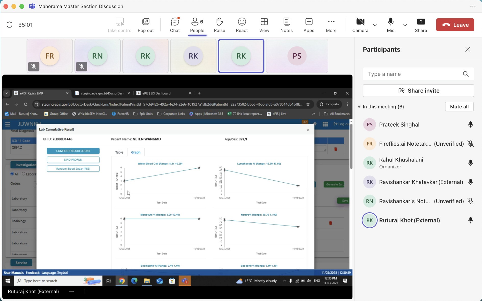
The project began with stakeholder meetings involving our tech team and senior medical practitioners. These conversations revealed several interconnected challenges that went beyond simple time management.
Core Challenges Identified
Time Constraints
Doctors were spending 15-20 minutes per appointment on documentation alone, significantly reducing the number of patients they could see and increasing their administrative burden.
Technology Barriers
Many experienced practitioners had limited comfort with complex digital interfaces including the existing complex system. Any solution needed to work for Doctors with varying levels of technical proficiency.
Accuracy Requirements
Medical documentation demands precision. While voice control seemed promising, concerns about transcription errors and the ability to quickly correct them were significant.
Workflow Disruption
Traditional EMR systems often disrupted the natural flow of doctor-patient interaction, forcing practitioners to divide their attention between the patient and the screen.
Research and Competitive Analysis
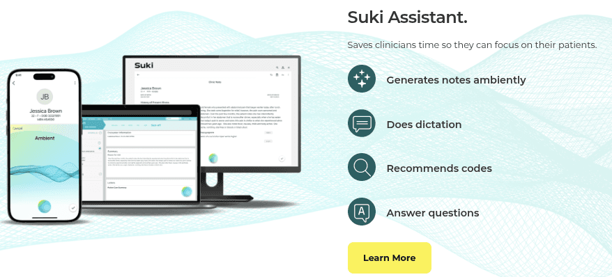
I analyzed existing solutions in the market, particularly Suki AI from the USA, to understand current approaches to voice-powered medical documentation. This research highlighted opportunities to differentiate through:
More intuitive error correction mechanisms
Simplified interfaces designed for low-tech-comfort users
Better integration of voice and manual input methods
Leveraging our in-house medically-accurate AI LLM model
The key insight was that successful implementation required designing with doctors, not just for them.
Design Strategy
I developed a problems-solutions framework that guided the entire design process:
High documentation time → Voice-controlled automation capturing natural conversation
Low technical comfort → Interface designed for immediate usability without training
Transcription errors → Quick, intuitive error correction workflow
AI reliability concerns → Transparent transcription with full manual override capabilities
The approach prioritized making technology invisible while keeping human control central.
The Design Process: Four Iterations
The design evolved through four major wireframe iterations, each informed by feedback from senior doctors and the technical team.
Iteration 1: Foundation
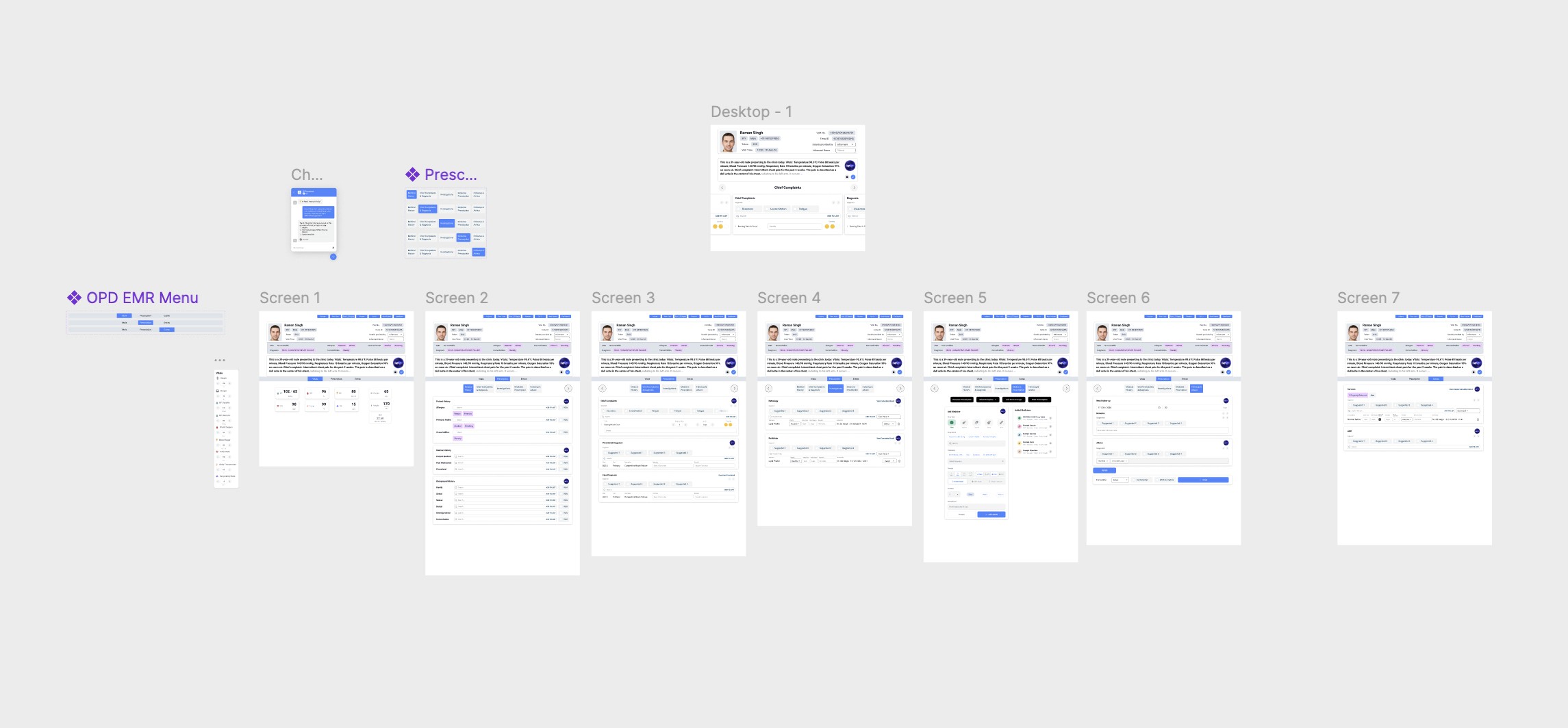
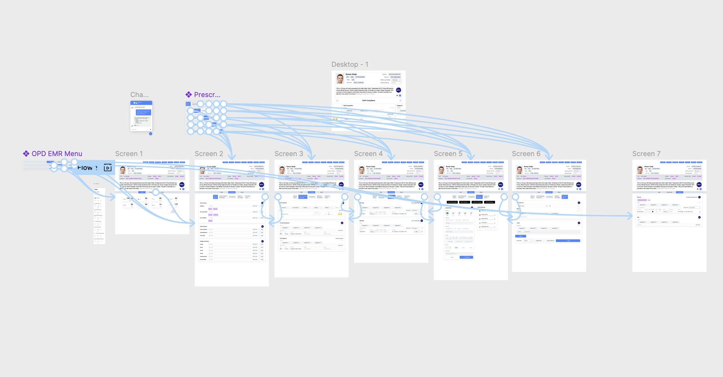
Created initial wireframes with prototypes establishing the core voice-control interaction patterns, information architecture, and basic user flows for patient documentation.
Iteration 2: Refinement
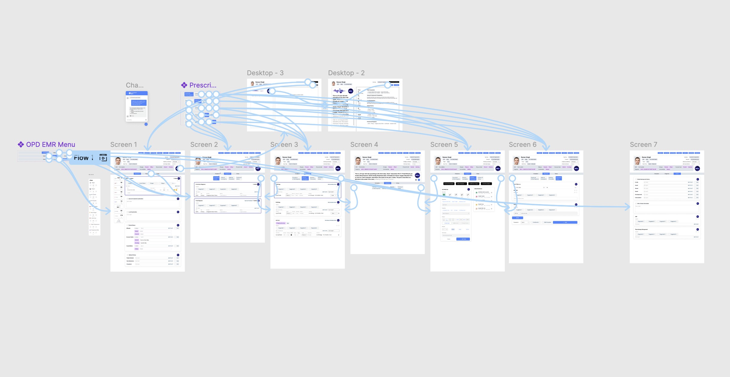
After the first review with stakeholders, I simplified navigation based on usability feedback, refined the voice command structure, and adjusted information hierarchy to match clinical priorities rather than technical logic.
Iteration 3: Optimization
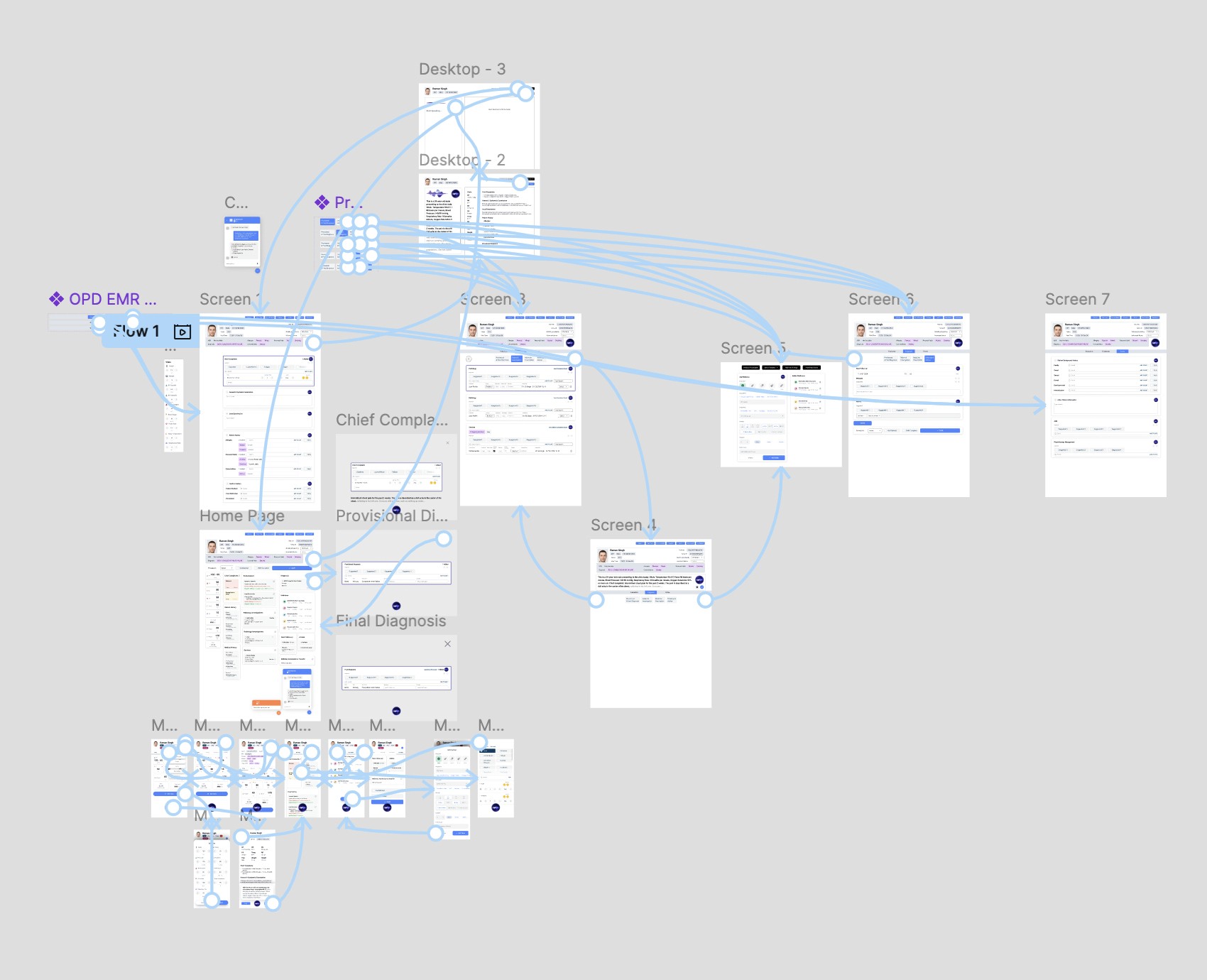
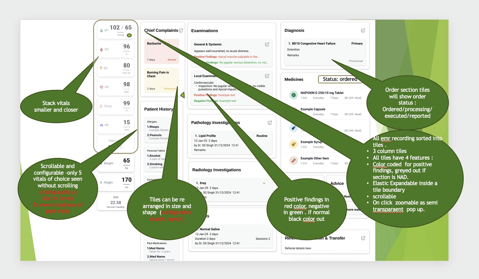
This version focused on improving error correction workflows, optimizing layouts for quick scanning, and enhancing visual hierarchy, also added mobile responsive designs. Testing revealed which elements doctors actually used versus what I thought they'd need.
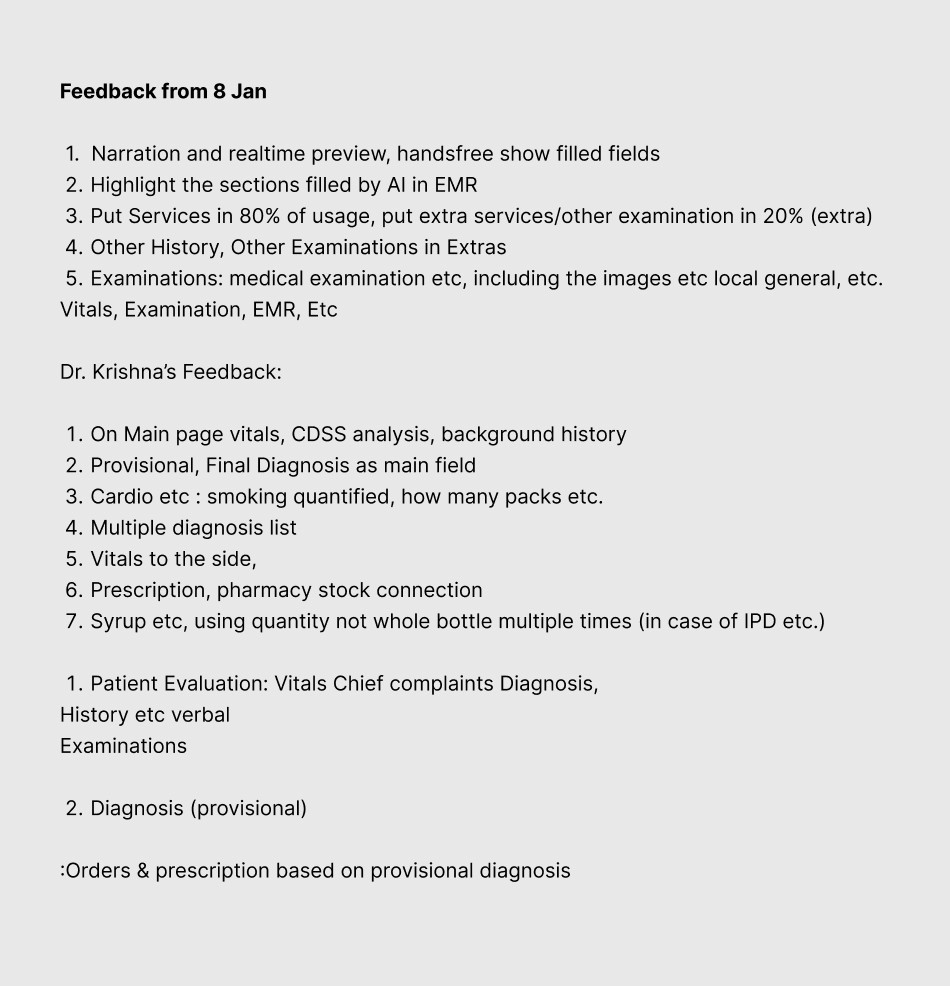
Some more feedback sent by the Doctors' team as a PPT:


Iteration 4: Finalization
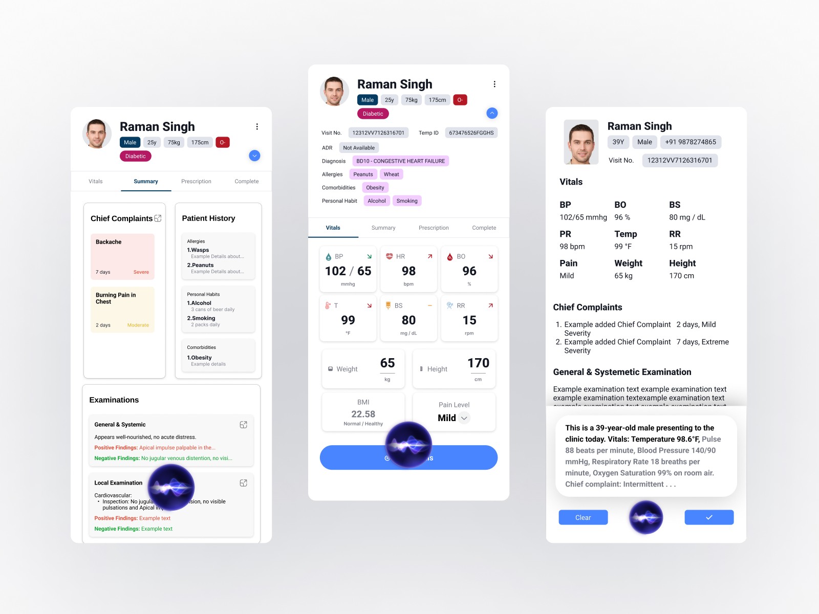
The final iteration polished interaction details, validated hands-on testing with senior doctors, and fine-tuned AI integration touchpoints. By this stage, the interface had evolved significantly from the original concept.

Key Insight: The final product looked starkly different from the initial wireframe, which validated the iterative approach. Each feedback cycle revealed practical considerations that weren't apparent without real-world testing.
Though it might look very manual-input centric here, it's worth noting that it still is aimed to be used using the Voice control but it was also a requirement by the doctors team to let the doctor edit any and all details filled with full efficiency and ease.
Core Design Principles
Simplicity Over Features
Every interface element needed clear purpose. The goal was removing friction, not adding capabilities.
Voice-Primary, Touch-Secondary
Voice control handled the heavy lifting, but manual editing needed to be equally straightforward. Neither mode should feel like a compromise.
Transparent AI Behavior
All AI transcriptions were clearly visible and immediately editable. Doctors maintained complete control while benefiting from automation.
Clinical Workflow First
Design decisions were validated against actual medical workflows, not theoretical use cases or aesthetic preferences.
Key Features
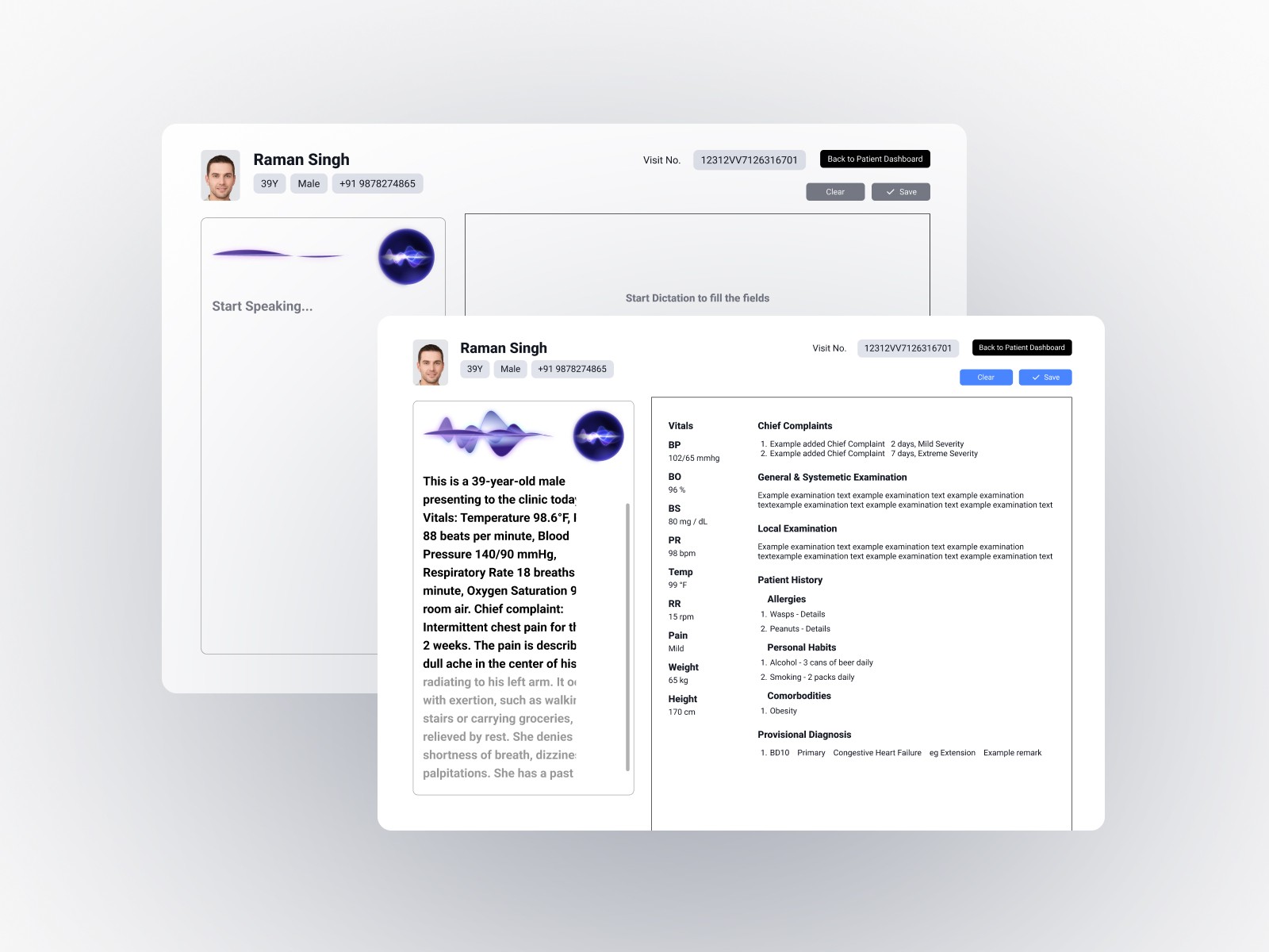
Voice-Controlled Documentation
Natural language processing captures doctor-patient conversations with medical terminology recognition. The system understands context, not just words, automatically populating relevant fields across EMR forms.
Intelligent Automation
The AI provides contextual suggestions based on symptoms and patient history, generates clinical notes automatically, and uses a continuous learning model that improved accuracy from 90% to 95% over time.
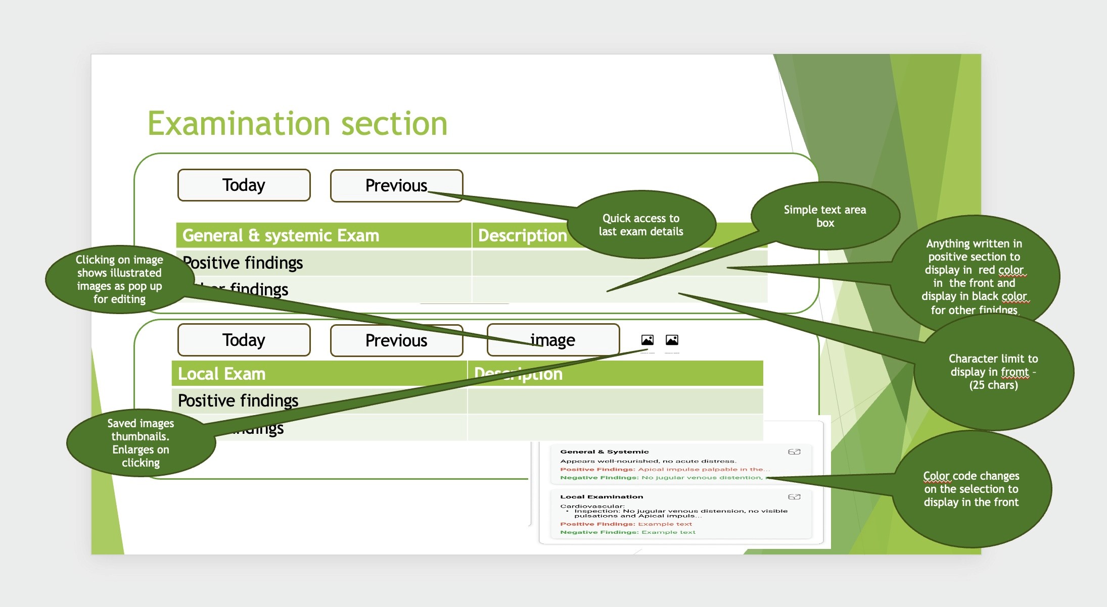
Intuitive Error Correction
Visual highlighting of AI-transcribed content with single-tap editing of any field. Large, accessible interaction targets and voice-based correction commands provide multiple pathways to fix errors quickly.
Streamlined Interface
Clean layouts prioritize essential information with logical grouping based on clinical workflows. The design accommodates low-tech-comfort users through progressive disclosure and clear visual hierarchy.
Results and Impact
Measurable Outcomes
75% Time Reduction
Documentation time dropped from 15-20 minutes to 3-5 minutes per appointment, directly increasing patient capacity and reducing administrative burden.
95% Transcription Accuracy
AI accuracy improved from an initial 90% baseline to 95% through continuous learning model optimization, with remaining corrections taking seconds rather than minutes.
Successful Deployment
The system was adopted across multiple clinics and hospitals with high user satisfaction, particularly among senior doctors initially skeptical of digital solutions.
Improved Patient Interaction
Doctors reported being able to maintain better eye contact and focus during consultations, as the system handled documentation in the background.
Key Learnings
Iteration Reveals Truth
The dramatic evolution from first wireframe to final product demonstrated that initial assumptions, however well-researched, require validation through real-world testing and user feedback.
Stakeholders as Co-Designers
Regular engagement with senior medical professionals was essential. Their expertise in clinical workflows provided insights that external observation couldn't reveal.
Simplicity Requires Discipline
Making the interface intuitive for users with varying technical skills meant constantly questioning whether each element truly served the core task.
Technology as Enabler
Success came from focusing on the problem (documentation time) rather than the solution (AI capabilities). The technology needed to disappear into the workflow.
Conclusion
Manorama EMR demonstrates how thoughtful UI/UX design can bridge advanced AI capabilities with practical clinical needs. The five-month journey from initial stakeholder meetings to deployment resulted in a solution that genuinely transforms healthcare workflows while maintaining the simplicity necessary for universal adoption.
The project reinforced that effective design requires persistent iteration, genuine collaboration with end users, and unwavering focus on solving real problems rather than showcasing technical capabilities.
AI Powered EMR
Overview
Transforming clinical documentation through intelligent voice control and intuitive design. Reduced doctor appointment documentation time by 75% (from 15-20 minutes to 3-5 minutes) while achieving 95% AI transcription accuracy through a user-centered design approach that prioritized simplicity and clinical workflow efficiency.
Categories
Healthcare
EMR
Date
Apr 2025
Client
Manorama Infosolutions
Project Overview
Manorama EMR is a next-generation electronic medical records system that uses AI-powered voice control to streamline clinical documentation. The project addressed a critical inefficiency in healthcare: doctors spending excessive time on administrative tasks rather than patient care.
Understanding the Problem
The project began with stakeholder meetings involving our tech team and senior medical practitioners. These conversations revealed several interconnected challenges that went beyond simple time management.
Core Challenges Identified
Time Constraints
Doctors were spending 15-20 minutes per appointment on documentation alone, significantly reducing the number of patients they could see and increasing their administrative burden.
Technology Barriers
Many experienced practitioners had limited comfort with complex digital interfaces including the existing complex system. Any solution needed to work for Doctors with varying levels of technical proficiency.
Accuracy Requirements
Medical documentation demands precision. While voice control seemed promising, concerns about transcription errors and the ability to quickly correct them were significant.
Workflow Disruption
Traditional EMR systems often disrupted the natural flow of doctor-patient interaction, forcing practitioners to divide their attention between the patient and the screen.
Research and Competitive Analysis
I analyzed existing solutions in the market, particularly Suki AI from the USA, to understand current approaches to voice-powered medical documentation. This research highlighted opportunities to differentiate through:
More intuitive error correction mechanisms
Simplified interfaces designed for low-tech-comfort users
Better integration of voice and manual input methods
Leveraging our in-house medically-accurate AI LLM model
The key insight was that successful implementation required designing with doctors, not just for them.
Design Strategy
I developed a problems-solutions framework that guided the entire design process:
High documentation time → Voice-controlled automation capturing natural conversation
Low technical comfort → Interface designed for immediate usability without training
Transcription errors → Quick, intuitive error correction workflow
AI reliability concerns → Transparent transcription with full manual override capabilities
The approach prioritized making technology invisible while keeping human control central.
The Design Process: Four Iterations
The design evolved through four major wireframe iterations, each informed by feedback from senior doctors and the technical team.
Iteration 1: Foundation
Created initial wireframes with prototypes establishing the core voice-control interaction patterns, information architecture, and basic user flows for patient documentation.
Iteration 2: Refinement
After the first review with stakeholders, I simplified navigation based on usability feedback, refined the voice command structure, and adjusted information hierarchy to match clinical priorities rather than technical logic.
Iteration 3: Optimization
This version focused on improving error correction workflows, optimizing layouts for quick scanning, and enhancing visual hierarchy, also added mobile responsive designs. Testing revealed which elements doctors actually used versus what I thought they'd need.
Some more feedback sent by the Doctors' team as a PPT:
Iteration 4: Finalization
The final iteration polished interaction details, validated hands-on testing with senior doctors, and fine-tuned AI integration touchpoints. By this stage, the interface had evolved significantly from the original concept.
Key Insight: The final product looked starkly different from the initial wireframe, which validated the iterative approach. Each feedback cycle revealed practical considerations that weren't apparent without real-world testing.
Though it might look very manual-input centric here, it's worth noting that it still is aimed to be used using the Voice control but it was also a requirement by the doctors team to let the doctor edit any and all details filled with full efficiency and ease.
Core Design Principles
Simplicity Over Features
Every interface element needed clear purpose. The goal was removing friction, not adding capabilities.
Voice-Primary, Touch-Secondary
Voice control handled the heavy lifting, but manual editing needed to be equally straightforward. Neither mode should feel like a compromise.
Transparent AI Behavior
All AI transcriptions were clearly visible and immediately editable. Doctors maintained complete control while benefiting from automation.
Clinical Workflow First
Design decisions were validated against actual medical workflows, not theoretical use cases or aesthetic preferences.
Key Features
Voice-Controlled Documentation
Natural language processing captures doctor-patient conversations with medical terminology recognition. The system understands context, not just words, automatically populating relevant fields across EMR forms.
Intelligent Automation
The AI provides contextual suggestions based on symptoms and patient history, generates clinical notes automatically, and uses a continuous learning model that improved accuracy from 90% to 95% over time.
Intuitive Error Correction
Visual highlighting of AI-transcribed content with single-tap editing of any field. Large, accessible interaction targets and voice-based correction commands provide multiple pathways to fix errors quickly.
Streamlined Interface
Clean layouts prioritize essential information with logical grouping based on clinical workflows. The design accommodates low-tech-comfort users through progressive disclosure and clear visual hierarchy.
Results and Impact
Measurable Outcomes
75% Time Reduction
Documentation time dropped from 15-20 minutes to 3-5 minutes per appointment, directly increasing patient capacity and reducing administrative burden.
95% Transcription Accuracy
AI accuracy improved from an initial 90% baseline to 95% through continuous learning model optimization, with remaining corrections taking seconds rather than minutes.
Successful Deployment
The system was adopted across multiple clinics and hospitals with high user satisfaction, particularly among senior doctors initially skeptical of digital solutions.
Improved Patient Interaction
Doctors reported being able to maintain better eye contact and focus during consultations, as the system handled documentation in the background.
Key Learnings
Iteration Reveals Truth
The dramatic evolution from first wireframe to final product demonstrated that initial assumptions, however well-researched, require validation through real-world testing and user feedback.
Stakeholders as Co-Designers
Regular engagement with senior medical professionals was essential. Their expertise in clinical workflows provided insights that external observation couldn't reveal.
Simplicity Requires Discipline
Making the interface intuitive for users with varying technical skills meant constantly questioning whether each element truly served the core task.
Technology as Enabler
Success came from focusing on the problem (documentation time) rather than the solution (AI capabilities). The technology needed to disappear into the workflow.
Conclusion
Manorama EMR demonstrates how thoughtful UI/UX design can bridge advanced AI capabilities with practical clinical needs. The five-month journey from initial stakeholder meetings to deployment resulted in a solution that genuinely transforms healthcare workflows while maintaining the simplicity necessary for universal adoption.
The project reinforced that effective design requires persistent iteration, genuine collaboration with end users, and unwavering focus on solving real problems rather than showcasing technical capabilities.


© 2025 Prateek Singhal
© 2025 Prateek Singhal
© 2025 Prateek Singhal