
iTrackHealth App
Overview
Transforming complex Apple HealthKit data into clear, actionable insights for everyday users. A three-week design sprint focused on making health metrics understandable for middle-aged users who want to track their wellness without technical complexity.
Categories
Healthcare
Mobile App
Date
Nov 2023
Client
iTrackHealth
Project Overview
iTrakHealth bridges the gap between Apple HealthKit's technical data and user-friendly health tracking. The app takes existing health data and presents it in a way that middle-aged users can easily understand and act upon.
The Challenge
Apple HealthKit collects comprehensive health data, but interpreting that data requires technical knowledge and comfort navigating complex interfaces. Middle-aged users wanted to understand their health metrics without feeling overwhelmed by numbers, charts, and technical terminology.
Core Problem: How do we make health data meaningful and actionable for users who aren't fitness enthusiasts or data analysts?
Design Approach
I started by identifying what information actually matters to middle-aged users tracking their health. Rather than showing every data point available, the focus was on clarity and actionability.
Key Design Decisions
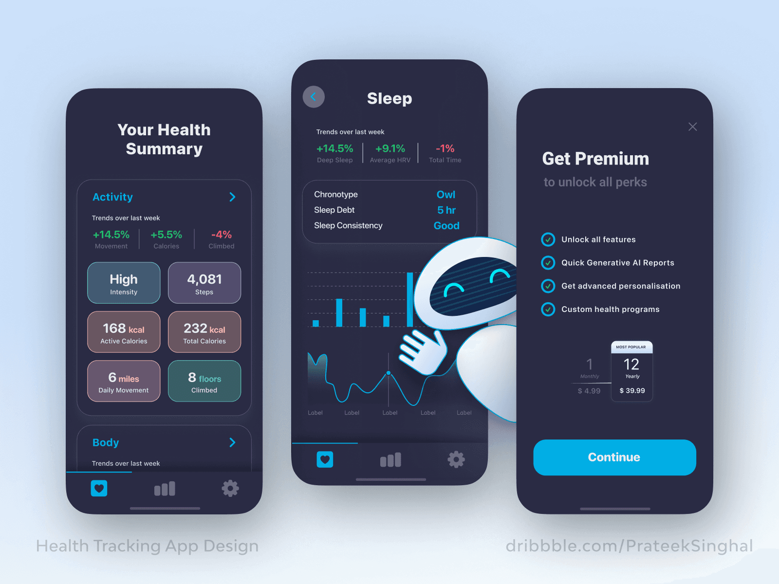
Visual Hierarchy
Large, clear numbers for primary metrics with color-coding to indicate performance (green for good, red for areas needing attention). Supporting details remain accessible but don't compete for attention.
Progressive Disclosure
The main dashboard provides a quick health snapshot. Users can tap into specific areas (Activity, Sleep, Trends) for more detailed information when they want it.
Contextual Understanding
Instead of just showing numbers, the interface explains what they mean. Recommendations appear alongside metrics to guide users toward healthier habits.
Accessible Design
High contrast text, generous spacing, and touch targets sized for easy interaction. Both light and dark modes accommodate different preferences and viewing conditions.
Design Process
Wireframing and Structure
I mapped out the information architecture to determine how health data should be organized. The wireframes focused on reducing cognitive load by grouping related metrics and creating clear pathways between summary and detail views.
Visual Design
The interface uses a clean, modern aesthetic that feels approachable rather than clinical. Soft colors, rounded corners, and friendly illustrations in onboarding create a welcoming experience.
Key Screens
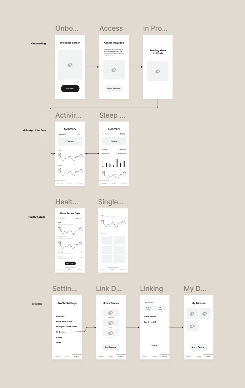
Onboarding Flow
Simple, guided setup that explains what the app does and requests necessary permissions. Clear messaging about data usage builds trust from the start.
Health Summary Dashboard
At-a-glance view of Activity, Sleep, and other key metrics. Each section uses cards with clear headings and visual indicators of performance.
Detailed Metric Views
Activity and Sleep screens provide deeper insights with charts showing trends over time. The data visualization remains simple and easy to interpret.
Trends & Recommendations
Proactive suggestions based on health patterns. This section turns data into actionable guidance without requiring users to interpret complex analytics themselves.
Key Features
Automatic Data Integration
Pulls health data directly from Apple HealthKit, eliminating manual entry and ensuring accuracy.
Smart Summaries
Presents daily, weekly, and monthly health overviews in plain language with visual cues.
Personalized Insights
Identifies patterns and provides relevant recommendations based on individual health data.
Dual Theme Support
Light and dark modes ensure comfortable viewing in any environment.
Clear Navigation
Bottom tab bar provides quick access to main sections: Summary, Activity, Sleep, Trends, and Settings.
Design Solutions
Making Numbers Meaningful
Rather than displaying raw data, metrics include context. "188 steps today" is paired with progress indicators and weekly comparisons so users understand if they're on track.
Reducing Complexity
The three-level information hierarchy (dashboard summary → category view → detailed metrics) lets users choose their level of engagement without feeling overwhelmed.
Building Confidence
Visual feedback through color and iconography helps users quickly assess their health status without needing to analyze data deeply.
Outcome
The three-week timeline resulted in a complete app design that successfully simplifies health data interpretation for middle-aged users. The interface prioritizes clarity and actionability, making wellness tracking accessible to users who may not be comfortable with data-heavy applications.
Key Achievement: Created an intuitive health tracking experience that removes technical barriers while maintaining the depth of information users need to make informed decisions about their wellness.
Learnings
Audience-First Design
Designing for middle-aged users meant reconsidering assumptions about interface density and complexity. What works for fitness enthusiasts doesn't necessarily work for general wellness tracking.
Data Visualization Matters
How information is presented is as important as what information is shown. Simple charts with clear labels proved more effective than feature-rich but complex visualizations.
Efficiency in Tight Timelines
The three-week constraint required focused decision-making. Prioritizing core user needs over comprehensive features resulted in a cleaner, more usable product.
iTrackHealth App
Overview
Transforming complex Apple HealthKit data into clear, actionable insights for everyday users. A three-week design sprint focused on making health metrics understandable for middle-aged users who want to track their wellness without technical complexity.
Categories
Healthcare
Mobile App
Date
Nov 2023
Client
iTrackHealth
Project Overview
iTrakHealth bridges the gap between Apple HealthKit's technical data and user-friendly health tracking. The app takes existing health data and presents it in a way that middle-aged users can easily understand and act upon.
The Challenge
Apple HealthKit collects comprehensive health data, but interpreting that data requires technical knowledge and comfort navigating complex interfaces. Middle-aged users wanted to understand their health metrics without feeling overwhelmed by numbers, charts, and technical terminology.
Core Problem: How do we make health data meaningful and actionable for users who aren't fitness enthusiasts or data analysts?
Design Approach
I started by identifying what information actually matters to middle-aged users tracking their health. Rather than showing every data point available, the focus was on clarity and actionability.
Key Design Decisions
Visual Hierarchy
Large, clear numbers for primary metrics with color-coding to indicate performance (green for good, red for areas needing attention). Supporting details remain accessible but don't compete for attention.
Progressive Disclosure
The main dashboard provides a quick health snapshot. Users can tap into specific areas (Activity, Sleep, Trends) for more detailed information when they want it.
Contextual Understanding
Instead of just showing numbers, the interface explains what they mean. Recommendations appear alongside metrics to guide users toward healthier habits.
Accessible Design
High contrast text, generous spacing, and touch targets sized for easy interaction. Both light and dark modes accommodate different preferences and viewing conditions.
Design Process
Wireframing and Structure
I mapped out the information architecture to determine how health data should be organized. The wireframes focused on reducing cognitive load by grouping related metrics and creating clear pathways between summary and detail views.
Visual Design
The interface uses a clean, modern aesthetic that feels approachable rather than clinical. Soft colors, rounded corners, and friendly illustrations in onboarding create a welcoming experience.
Key Screens
Onboarding Flow
Simple, guided setup that explains what the app does and requests necessary permissions. Clear messaging about data usage builds trust from the start.
Health Summary Dashboard
At-a-glance view of Activity, Sleep, and other key metrics. Each section uses cards with clear headings and visual indicators of performance.
Detailed Metric Views
Activity and Sleep screens provide deeper insights with charts showing trends over time. The data visualization remains simple and easy to interpret.
Trends & Recommendations
Proactive suggestions based on health patterns. This section turns data into actionable guidance without requiring users to interpret complex analytics themselves.
Key Features
Automatic Data Integration
Pulls health data directly from Apple HealthKit, eliminating manual entry and ensuring accuracy.
Smart Summaries
Presents daily, weekly, and monthly health overviews in plain language with visual cues.
Personalized Insights
Identifies patterns and provides relevant recommendations based on individual health data.
Dual Theme Support
Light and dark modes ensure comfortable viewing in any environment.
Clear Navigation
Bottom tab bar provides quick access to main sections: Summary, Activity, Sleep, Trends, and Settings.
Design Solutions
Making Numbers Meaningful
Rather than displaying raw data, metrics include context. "188 steps today" is paired with progress indicators and weekly comparisons so users understand if they're on track.
Reducing Complexity
The three-level information hierarchy (dashboard summary → category view → detailed metrics) lets users choose their level of engagement without feeling overwhelmed.
Building Confidence
Visual feedback through color and iconography helps users quickly assess their health status without needing to analyze data deeply.
Outcome
The three-week timeline resulted in a complete app design that successfully simplifies health data interpretation for middle-aged users. The interface prioritizes clarity and actionability, making wellness tracking accessible to users who may not be comfortable with data-heavy applications.
Key Achievement: Created an intuitive health tracking experience that removes technical barriers while maintaining the depth of information users need to make informed decisions about their wellness.
Learnings
Audience-First Design
Designing for middle-aged users meant reconsidering assumptions about interface density and complexity. What works for fitness enthusiasts doesn't necessarily work for general wellness tracking.
Data Visualization Matters
How information is presented is as important as what information is shown. Simple charts with clear labels proved more effective than feature-rich but complex visualizations.
Efficiency in Tight Timelines
The three-week constraint required focused decision-making. Prioritizing core user needs over comprehensive features resulted in a cleaner, more usable product.


© 2025 Prateek Singhal
© 2025 Prateek Singhal
© 2025 Prateek Singhal